
This service collects and presents key healthcare data from private providers allowing patients to make informed decisions. Collaborating with NHS Digital and domain experts to enable and measure better patient outcomes and performance.
46%
30%
19%
4:1
Other Performance indicators:
- Improvements in search functionality to serve 20,000+ monthly visitors, and ~419,000 visitors annual users.
- Improved accessibility (legibility, visual land-marking, access to fees information) in practitioners' profile presentation, serving the 97-98% patient user base.
- ~50% reduction in data submission time with progressive disclosure forms enhancing data quality, and addressing user feedback about profile gaps.
Initial handover
While I followed a Design Thinking cycle of Discovery → Research → Ideation → Design → Validation, the tasks of migrating the legacy systems and delivering under UK's CMA deadlines and regulatory mandates often required a more 'waterfall' approach.
Throughout these cycles, my purview was:
- Heuristic Evaluation and competitor / marketing analysis of other healthcare information platforms, identifying UX benchmarks and WCAG accessibility compliance gaps, with a focus on web-based search interfaces.
- Fast-paced Discovery, Ideation, wire-framing with stakeholders and internal clients.
- Assisted all three Engagement Teams in User Research, focusing on coordinating effective research strategies and interpreting findings.
- Provider-facing Portal and Website: I delivered regular updates to ensure CMA compliance and coordinated a staged implementation involving multiple stakeholders.
- Refit of legacy Design Systems from Sketch to Figma and while bringing UI consistency across multiple products and frameworks (MUI, React, Svelte).
To service the aforementioned these family of digital products, I developed a single MUI/React Atomic Design System from the ground up. This shared library features nested, responsive components, tokenisation (e.g., a GDS-inspired type scale, color palettes, and tools for managing UX microcopy (e.g. Frontitude), as exemplified below).

Discovery phase
The data-gathering side of this service consisted in complex roles each with different user permissions (Practitioners, Medical Secretaries, Hospital Administrators, and Anaesthetists).
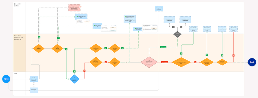
- User Permission matrix showing relationships (e.g., MedSecs administering multiple Practitioner profiles)
- Practitioner Onboarding with regulatory verification requirements
- Multi-stage publishing workflows for data validation and release
This analysis highlighted user needs and friction points across both platforms. The Portal in particular demanded a lot from users of varying tech literacy, while patients needed a smoother search experience.
Design Stage
Prototyping a simpler search
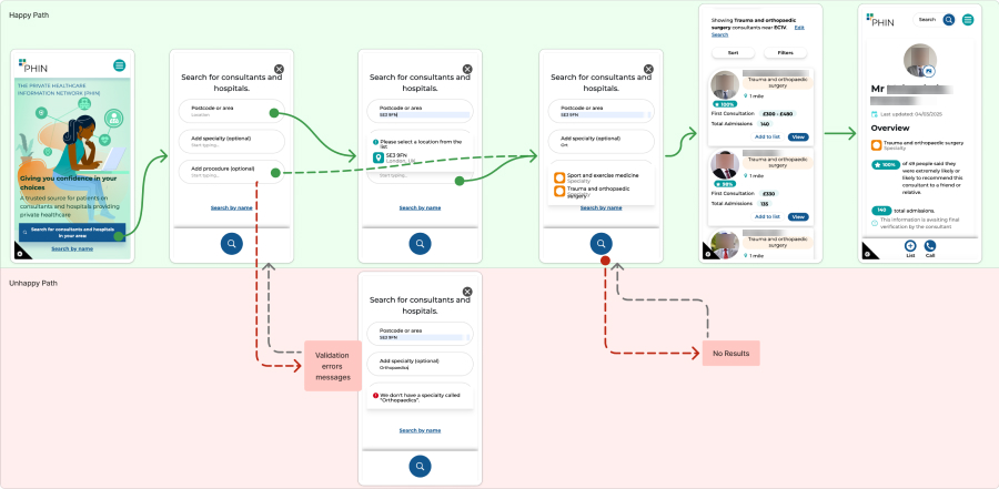 Analysis of the current search mechanics
PHIN's website search functionality warranted an UX audit of the current feature and a redesign to reduce complexity. To better illustrate this solution, I coded a a prototype on Cursor, which I analyse in more dept here.
Search bar is positioned at the bottom for optimal ergonomic access. IP-based geolocation is default, with optional refinement via postcode or map pin drop. This seeks to reduce cognitive load and easing access to relevant information.
Data standardisation and form improvements
For a more consistent column ordering and information hierarchy across the Portal, I proposed and iterated with medical advisors a structure inspired by the journalistic 5Ws: First when, then who, what, and how. This established documentation for best practices in table design, reducing cognitive load across tables.

For practitioner's data submission, I designed a stepped "wizard" form with progressive disclosure. This received praise both from stakeholders and end users who found it dramatically improved their task completion time.

Visual design
With Management's support, I migrated from Sketch to Figma, which enabled a unified Master Library serving the aforementioned patient-facing website and the provider-oriented portal.
I also introduced a new type scale inspired by GOV.UK design standards, enhancing visual hierarchy and laying groundwork for future WCAG-compliant accessibility improvements. The challenge was creating a design system that catered to two different frontend frameworks (React/MUI and Svelte) while gradually bringing their visual languages closer together.
