

The Touch Surgery app (rebranded as Digital Surgery) is a mobile application designed to simulate surgical training, with a unique mechanic combining gamification and spaced repetition. It caters to all levels of medical practice, providing a comprehensive library of procedures and articles from reputable sources like Stanford and Imperial College.
2M+
160
Growth Award
In-depth articles
Below you can access some detailed analysis of other topics and internal R&D projects for Touch Surgery, notably:
- Brand Overhaul (coming soon)
- An internal R&D Real-Time 3D Module Prototype
- An internal R&D wearable for the OR
Problem Statement
I joined TS with an MVP already in existence. Yet stakeholders believed both the app and the brand needed urgent redesign.
Additionally, there were a number of game-mechanics and aspects of usability and value of the hypothesis underpinning the product, which required validation, such as:
- Spaced repetition, (reinforcing learning by reviewing concepts at strategically timed intervals to improve retention) was a relatively new concept in learning apps, and never proven before in surgery simulation.
- Gamification adds elements like streaks, rewards, and challenges to make learning engaging and addictive. Would these strategies would translate successfully to surgical practice?
- Would these prove valuable as well for non-surgeons, such as general practitioners, nurses, or even patients (see validation)
Empathise, Understand, Research
Since the founders were surgeons themselves, one of whom was in a teaching position, I had direct access to invaluable expertise. Yet, to avoid the risk of implicit biases, we conducted qualitative research through interviews with surgeons from Imperial College and Guys' Hospital, among others.
These User types (or 'personas') were hypothesised and later refined: Group A (pictured): 1 Junior Resident/Trainee, 2 Senior Resident, 3 Consultant / Attending Surgeon. Group B: GPs, SAS (Specialists), nurses, paramedics. Group C: Patients' Associations, the general public.
 Group A pictured here was the main target, being composed of trainees in their first day in Med School, practicing surgeons, up to senior attending surgeons.
A fourth group could be thought to overlap with the latter: The authors, highly experienced pioneers in revolutionary surgical procedures such as Ear Reconstruction, Hip Replacement and so on.
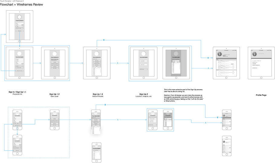
 Having an MVP on which to build, an analysis was in order. The user journey was fairly intuitive, but could be optimised in places and ensure it was future-proof. Here's a high-level overview of the existing flow.
Design Process
Ideation
We mirrored an approach advised by the likes of Dr. Robin Skinner and comedian John Cleese, having an early, time-boxed stage of "open mode" thinking, with no constraints of colours, shapes or function, as exemplified below. A "closed mode" phase can then harvest the overall design while efficiently selecting key features from a larger pool of 'sacrificial concepts' that in turn inform the project backlog.

User Flows
Again thinking with our hands, and with the benefit of insight into the user base composition, sketching a 'happy path' on a whiteboard allowed us to identify the high-level user journey, information architecture and some potential pitfalls in both UX and implementation.

Wireframing
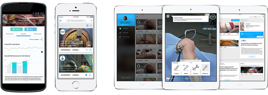
 From left to right: Procedure Library (or content hub), a centralised, interactive list for browsing, managing, and tracking content, likely user-specific. Side drawer menu with sorting or filtering functions, and a Progress Dashboard. It provides a clear, comparative overview of the user's performance and achievements against set benchmarks, designed to motivate users through visual progress tracking and peer comparison.
Prototyping
Prototyping complex interaction design (IxD) ideas is one of my favorite parts of UX (follow the tag here), but in a fast-moving startup, building a high-fidelity prototype isn't always the best use of time.
 At TS, we often used a hands-on approach: We printed our screens and used adhesive tack on a whiteboard, visualising the user flow. It made discussions faster, alignment easier, and ideas clearer.
Once the flow was solid, we refined specific interactions, tested ergonomics and the narrative of transitions and timings using tools like Principle App.
When needed for wowing stakeholders, we combined the logic and mechanics into a full high-fidelity prototype in InVision, (back then the leading prototyping online tool). By that point, we had already done the heavy lifting, and the final prototype was simply a polished version of a well-tested design.
Visual design
The visual design focused on clarity and usability for both iOS and Android. We established a consistent design language that aligned with the app's educational purpose, featuring a timeline indicating the learning progress, per-module visualisation activity, a masonry-style homepage with relevant articles and a tagged list of procedures that could be downloaded and played offline.
Validation
User testing
User testing sessions were conducted to evaluate the effectiveness of the new design, particularly in areas such as offline access to content, accessibility and intelligibility of the game mechanics. Feedback from surgeons and trainees highlighted areas for further refinement.
Additionally, we recorded a non-trivial number of users being patients (or relatives of patients about to undergo a specific procedure) who had downloaded the app to gain a better understanding of a particular procedure, and what to expect. This highlighted the app's potential not only as a training tool for medical professionals but also as an educational resource for patients, emphasising the need for clear, accessible, and user-friendly content.