Branding
Kirontech's brand redesign
Kirontech Branding overhaul included stationery design, web and interaction design, and in parallel with its Atomic Design System also covered in the UX-focused Case Study.

Typography with Purpose
Choosing the right typeface has been often associated with picking a tone of voice; — so strong brand identity begins with thoughtful use of typography.
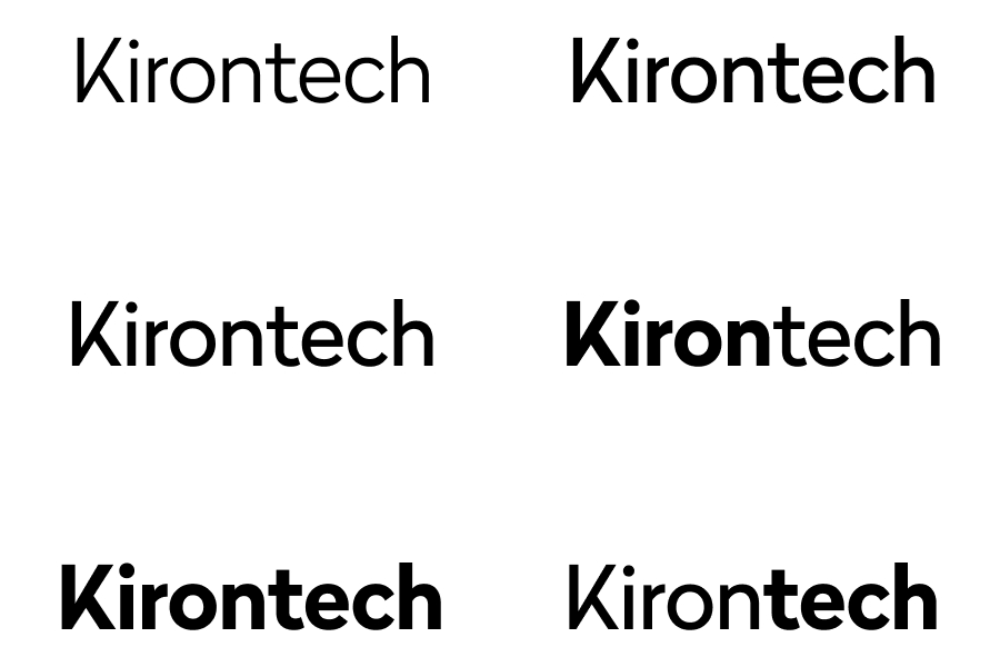
After presenting various options, we selected Radikal, a commercial typeface that struck a balance between technical precision and approachable professionalism. It's above-average legibility across digital and print, but also its distinctive 'K' glyph, which provided an immediate visual hook for the Kirontech name. This allowed for stationary design with a personality.
Symbolic Visual Language
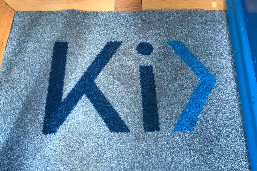
Then I tested how Radikal balanced visual weights and white space, ultimately crafting a logo that suggested the shape of two opposing chevrons. The inverse shape created by the 'K' character formed a closing ">" bracket—a meaningful nod to the programming syntax that underpins Kirontech's product.


Colour Strategy with Functional Intent
Starting with low-fidelity wireframes, I deliberately incorporated the brand colours to define distinct functional areas of Kirontech's website at an early stage, and allocate microcopies' length and function.
This brand overhaul wasn't just a visual refresh—it was a strategic realignment of Kirontech's identity with its core values and technological expertise, setting the foundation for all customer-facing communications.

