
A FAWE-detection SaaS specifically designed for health insurance providers, focusing on healthcare fraud and malpractice where lives were ultimately at stake.

~50%
~10hs.
38%
Cross-team collaboration
While reporting to the CEO and collaborating with the whole team, we transformed the brand and redesigned the entire user experience for underwriters and Special Investigation Units (SIU) combining industry best practices for complex, data-dense UI, with mindful out-of-the-box thinking for data visualisation.
The key impacts of this approach are a ~50% in claims processing time (roughly from 10 to 5 days), £20M annual savings through improved fraud detection, - 6-10% actionable recovery rate on identified at-risk cases. A particular case study on dentals highlighted 14% of billings flagged, ~£7M in one test case. For context, Healthcare insurance fraud amounts to 7.3% globally, an estimated $740 billion.
The Challenge
Making Complex Data Actionable
Our platform needed to help two distinct user groups navigate and sift through massive datasets with what could be argued to be a diverging needs. Underwriters needed to speed up screening for risk assessment, while SIU Investigators sought a deeper analysis of flagged cases; while Managers needed to generate automatic yet curated reporting.
 Abridged service map for health insurances.
1. In-Field Research
While refining aforementioned initial requirements, in-field sessions showed underwriters juggle over 20 cases at once, and many open tabs. Thusly, performance issues were behavioural rather than technical. This informed the need to provide a native workflow management solution, which I shall cover in more depth in a dedicated article.
 (Image illustrative, AI-generated)
2. Branding Overhaul

I transformed the company's visual identity into a trust-inspiring, recognisable brand conveying expertise and reliability. See its dedicated post for more.
3. Information Architecture (IA) Matching Mental Models
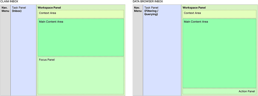
The UI hierarchy consists of:
- An standard main navigation left hand side drawer (or top bar) to navigate sibling screens, account, and support pages.
- Pages can then be categorised as Proactive, querying and filtering over large data base, or Receptive: Think an Inbox for FAWE case alerts.
- Lastly, the workspace area supports analysis with flexible content hierarchy and contextual detail panels for focused work.
.
I revisited this responsive UI concept with an HTML+SASS+JS prototype demonstrating screen real estate optimisation and interaction patterns. Kept it minimalistic to protect the client's IP.
This structure uses UX familiar patterns of many data dashboards and natural reading patterns to introduce its own privative IA.
Design Strategy
Rapid Prototyping for Complex Interactions
Setting a foundational Atomic Design System (pictured above) was an evident choice, but with the product vision forecasted incremental yet heavy customisation needs. This warranted a smooth Design Handover and clean implementation with very low Technical Debt.
To keep the ideation stage lean, I used:
- Very rapid, low-fidelity prototypes with Principle, testing IA, refine responsiveness and breakpoint strategies.
- Low-to-mid fidelity comprehensive prototypes with Figma
- Low-to-High, feature-specific or targeted prototyping with Figma or HTML+CSS+JS.
- Straight to High-Res Mockups, increasingly so as the Design System matures and on a need basis.
These provided stakeholders with the chance to evaluate core concepts and functionality early in the process, and early formative user testing with a few users.
This supported:
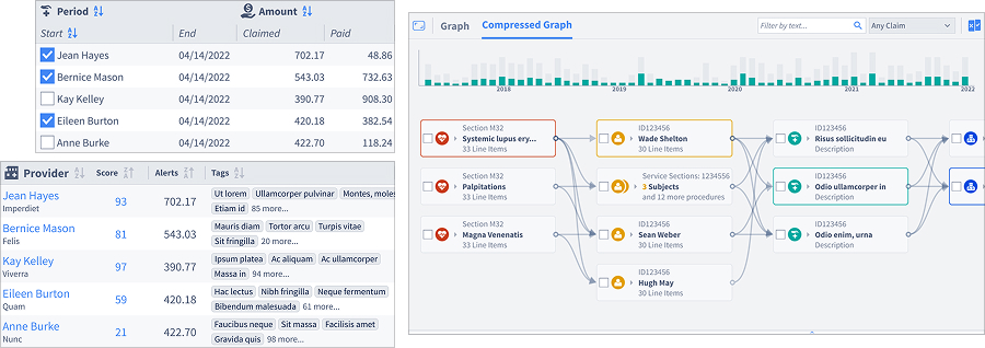
- Data-dense tables: Readable, sortable, highly responsive
-
Custom iconography: Specialised concepts beyond standard libraries

- Persistent filtering: Unobtrusive but always accessible
- Subtle hover states: Aid navigation through complex datasets
- Novel visualisations: Complex relationship mapping.
Skills Demonstrated
- Strategic Design: Business impact measurement, stakeholder management, CEO-level reporting
- User Research: Environmental observation, qualitative interviews, in-situ testing
- Systems Thinking: Atomic design system, scalable information architecture
- Technical Leadership: Cross-functional collaboration, design system implementation
- Domain Expertise: Healthcare insurance, fraud detection, regulatory compliance